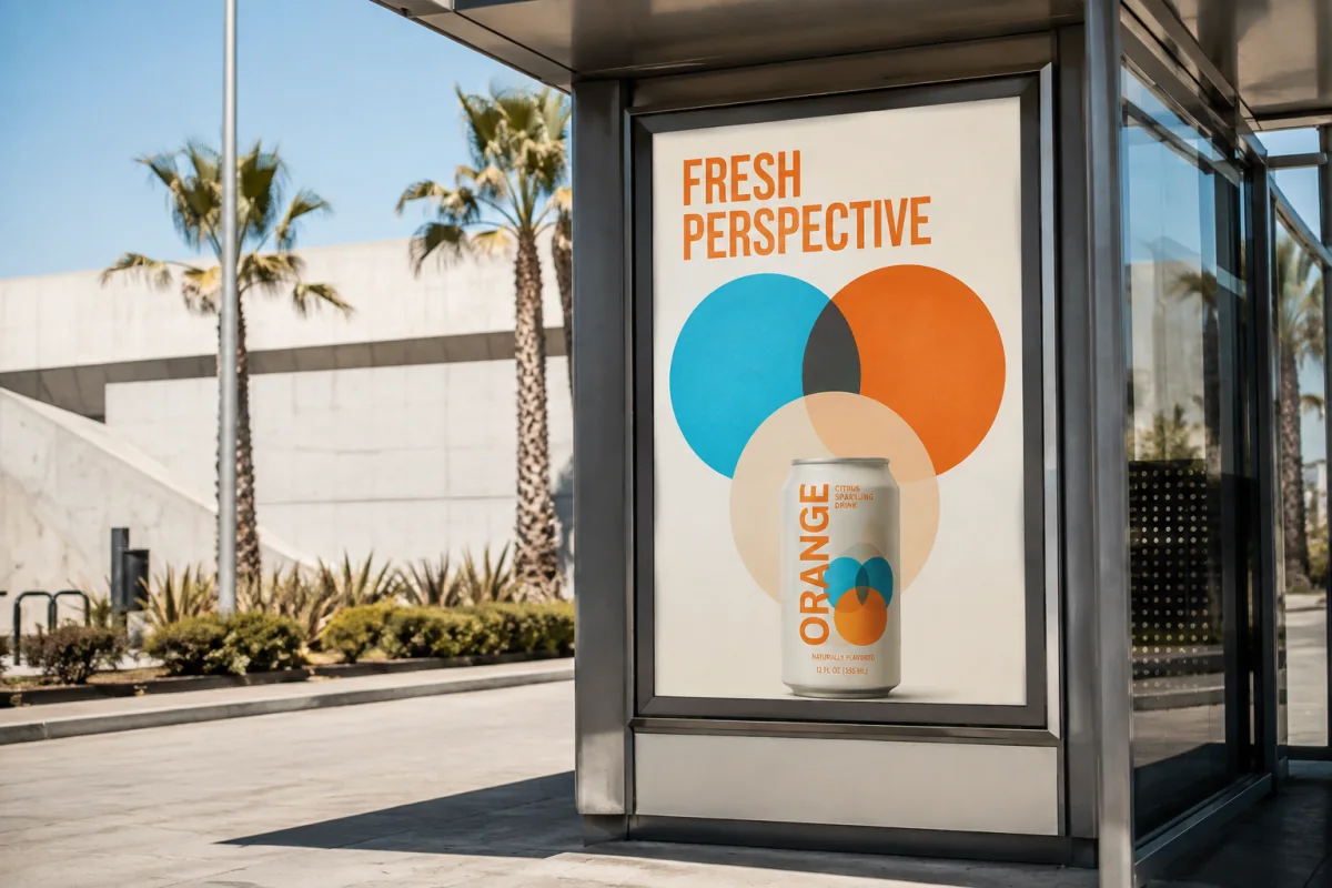
Studio concept / Brand identity & packaging
ORANGE. A fresh perspective.
A bold citrus identity built to move from the shelf to the screen.
Self-initiated concept · AI-generated mockups · Not a client commission
01 / The brief
Start with the right question.
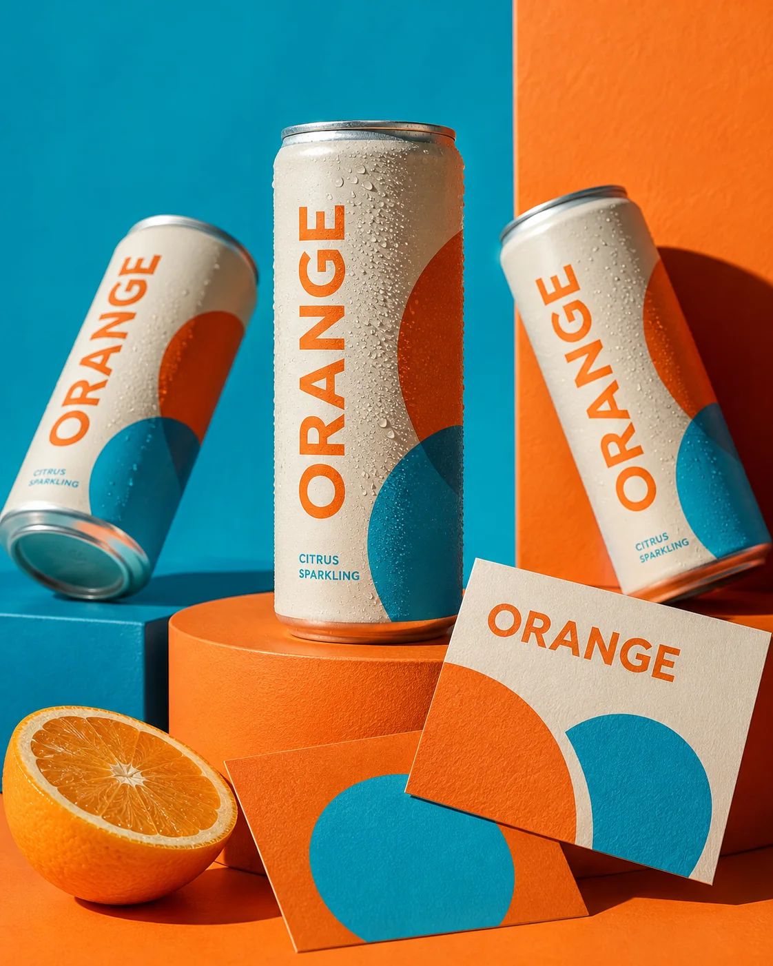
Explore how a new sparkling drink could stand out with a small, consistent set of visual ingredients. The concept needs to feel refreshing at a glance and remain recognizable on a can, a printed card and a digital launch.
02 / The approach
Make the idea work together.
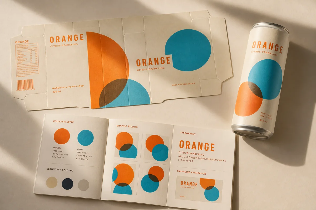
Intersecting circles suggest sliced fruit and bubbles. Cream creates room for the product name, while cyan and orange provide contrast. The same shapes can expand across packaging without relying on a different illustration for every format.
03 / What the concept explores
- Visual identity direction
- Packaging concept and layout
- Launch-ready graphic system
Bring this thinking to your business.
Your audience, content and requirements shape the final scope. Explore the services behind this direction.